MindTools
UX research, design system, and interface design for a 24M-user learning platform — covering a B2C website redesign, an internal CMS, and discovery work on search and content recommendation.
Context
MindTools is a global learning platform serving 24 million professionals annually with articles, videos, and toolkits for leadership, management, and personal development. In 2021, they partnered with DevSquad to address two parallel gaps: a B2C website that wasn't converting, and an internal operation running without proper tooling.
I joined as UX Designer and became UX Generalist — embedded in Agile sprints, working across product managers, engineers, QA, and stakeholders, with Confluence for documentation and Jira for task tracking.
The scope covered three interconnected workstreams: a full B2C website redesign, an internal CMS called The Ark, and discovery work on two platform features — content recommendation and search.
The Problem
MindTools had a reach problem and an efficiency problem happening simultaneously.
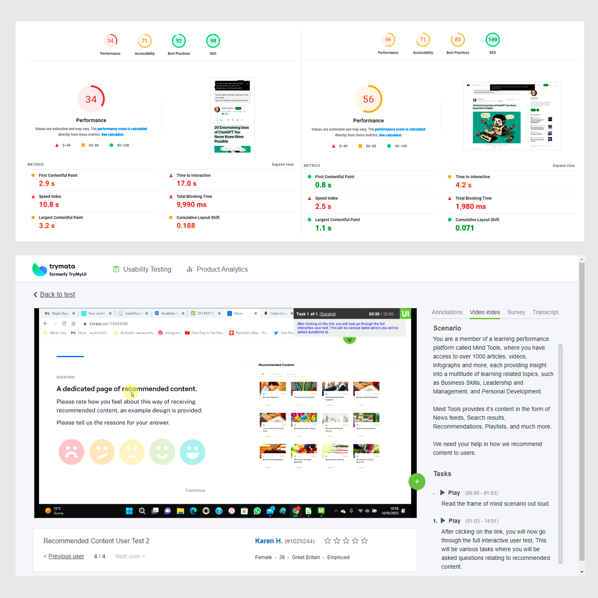
On the B2C side, the public website wasn't converting visitors into subscribers. Content discoverability was weak, and the journey from landing to subscription had measurable drop-offs that analytics could show but the team didn't have the UX process to act on.
On the B2B and operations side, CX agents and content managers had no dedicated tooling. Workflows for user onboarding, permission management, and content scheduling were handled outside purpose-built software — creating overhead that scaled badly as the client base grew.
Underneath both: a design function that needed to mature. There was no shared design language, no systematic research practice, and limited cross-team alignment between design and engineering.
Design Team
UX Generalist (me), UI Designer, UX Research Lead, Designer Lead - interacting with Dev and Business teams
Process
Research
10 stakeholder interviews across CX and product. 20 remote user sessions via Maze and TryMyUI. 3 months of engagement data reviewed through GA and Hotjar. 5 competitor learning platforms benchmarked.
The goal wasn't just to collect data — it was to build a research practice the team could repeat.
Ideation
Four half-day design sprints with the cross-functional team. 40 sketches across page types. 25 low-fidelity wireframes covering the public site and The Ark. Three journey maps: B2C subscription flow, B2B admin, and CX daily tasks.
Validation
6 mid-fidelity prototypes in Figma. Tested with 50 participants across four scenarios each. 30 usability issues logged, 100 satisfaction scores collected. Two major design iterations before handoff.
Execution
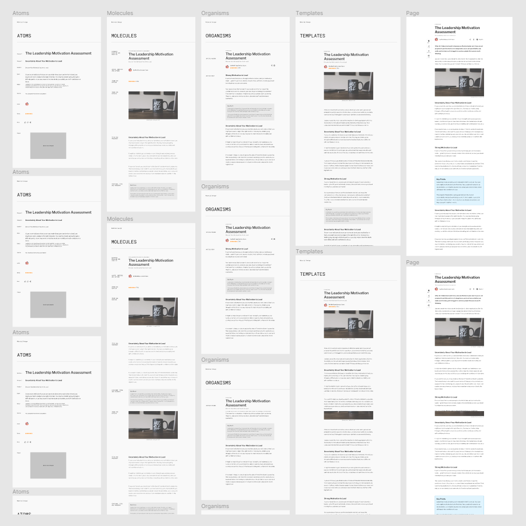
Eight high-fidelity mockups delivered with style-guide handoff. 10+ pages of design documentation authored in Confluence. Eight sprint syncs and six QA cycles supported. 100+ components contributed to the Figma design system.
Projects
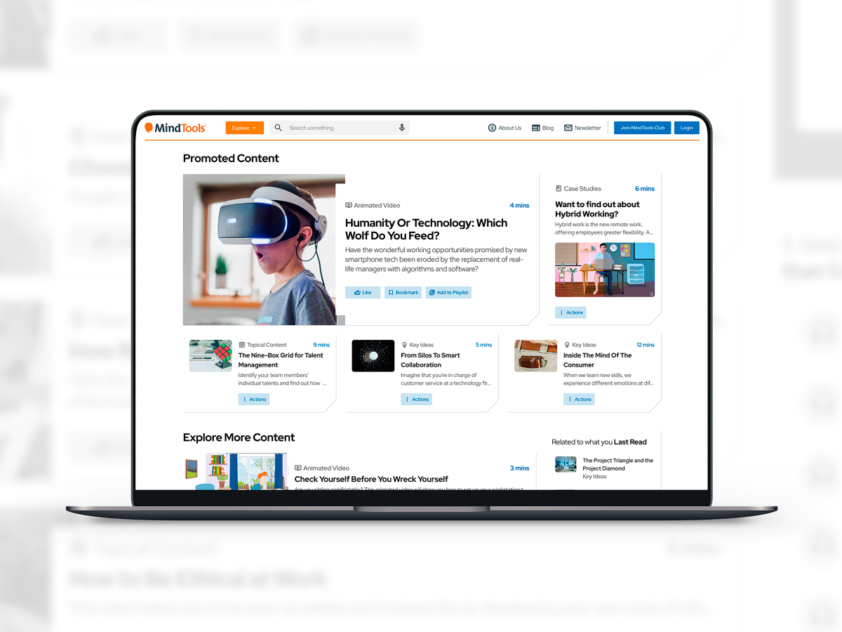
1. B2C Website Redesign (2023 version)
Analytics deep-dive to identify drop-off points. Wireframed new homepage, article layouts, and subscription flows. A/B tests on headline treatments and CTA placements. User feedback from 50+ remote sessions incorporated across two major iterations. Delivered annotated redlines, component library, and accessibility checklist to engineering.
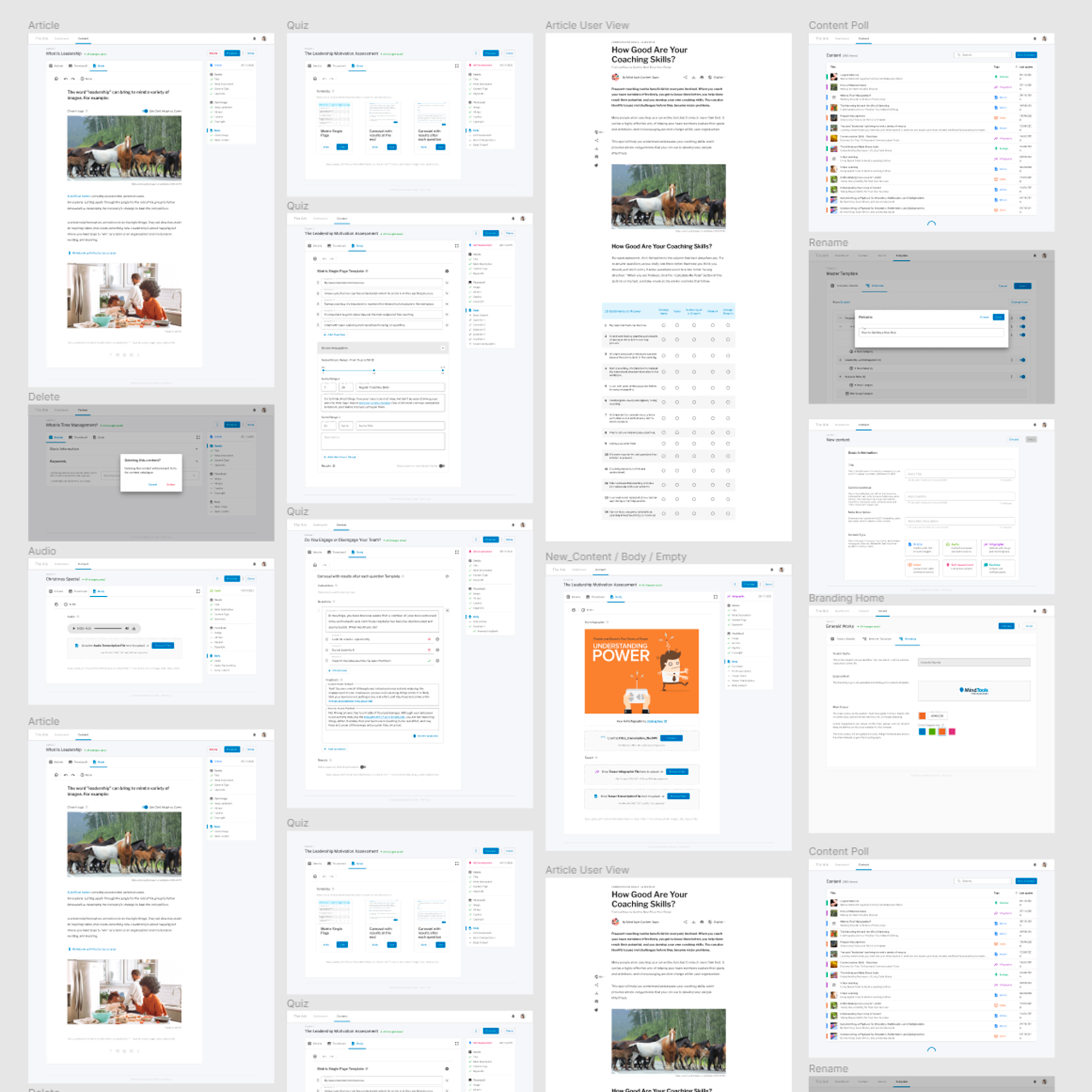
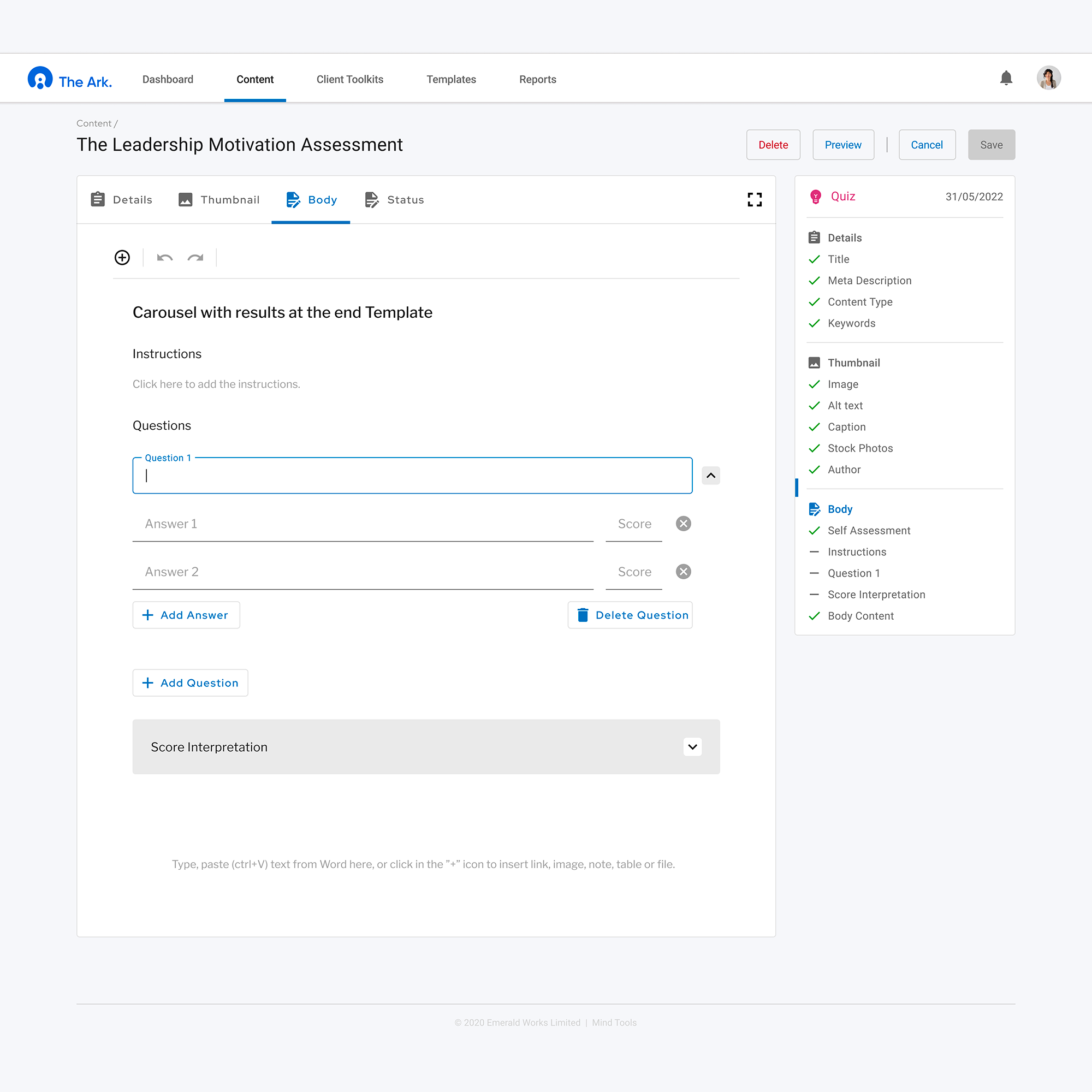
2. The Ark — Internal CMS
Co-design workshops with CX agents, content managers, and B2B clients to map admin workflows from the ground up. Defined 15+ core user journeys — user onboarding, permission grants, content scheduling, bulk operations. Extended the public design system with admin-specific patterns: tables, nested permissions UI, error-handling flows. Rapid prototype testing with internal users, iterating on the interactions that caused the most friction.
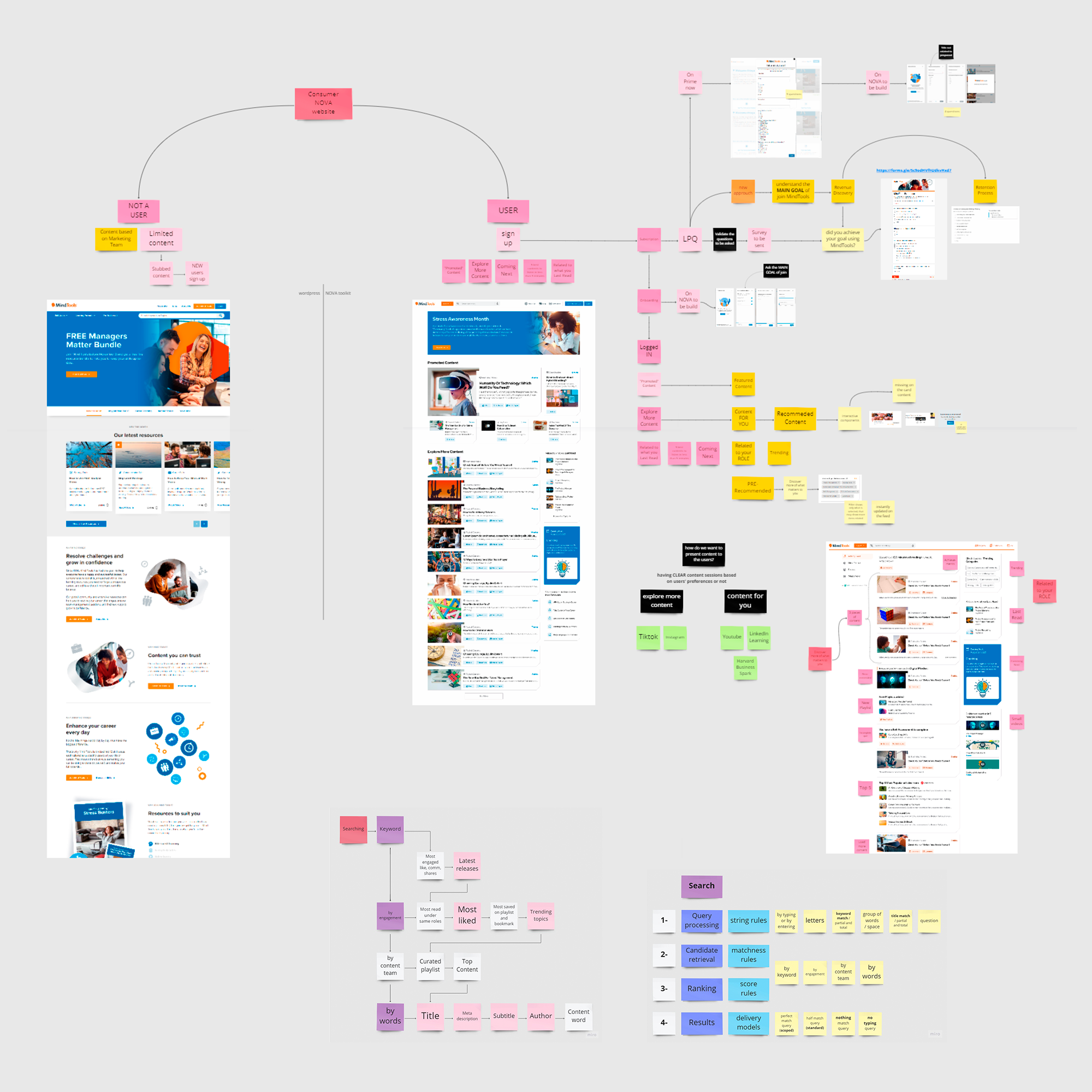
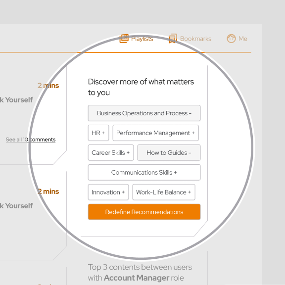
3. Content Recommendation — Feature Discovery
Designed a personalised content recommendation system without making it feel intrusive.
The core question:
how do you collect the data needed to recommend well, without eroding user trust?
Ran 10 user interviews and 10 interactive Maze missions. Audited 5 third-party recommendation engines. The outcome was three user stories driving prototype scope — recommendations based on role and seniority, collaborative filtering with explicit "see less" controls, and interest-based discovery tied to onboarding responses.
Also identified a structural UX debt: the subscription questionnaire collected marketing data (country, industry, company size) with no connection to the learning experience — a missed personalisation signal.
Delivered 4 final mockups, 1 tool-evaluation matrix and integration roadmap, 6 new design system components.
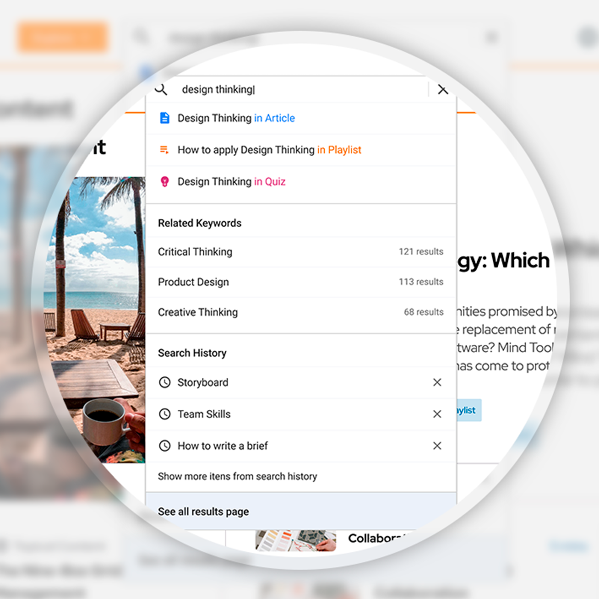
4. Search Experience — Feature Discovery
Decomposed the search pipeline into four stages — query processing, candidate retrieval, ranking, results delivery — to design the right UI for each state rather than a single generic search box.
Designed 3 delivery models: empty state (recommended keywords + recent searches), typing state (live related keyword suggestions), and zero-results state (friendly recovery with steered alternatives).
Partnered with data science to align UI patterns with back-end scoring weights.
Ran 12 remote usability tests, logged 28 usability issues, and iterated through 2 design versions.
Delivered 5 high-fidelity mockups, 6 pages of edge-case documentation, and 4 search-widget components added to the design system.
Impact
- 15+ user journeys designed and delivered across B2C and The Ark
- 100+ components contributed to the shared Figma design system
- 50 participants tested across the B2C redesign; 2 major iterations completed before launch
- 12 usability issues resolved in the search feature through prototype testing
- A design system extended to cover both public-facing and internal admin contexts — reducing inconsistency across products
- A repeatable research practice established: stakeholder interviews, remote usability testing, analytics review, and competitive benchmarking running in parallel with delivery
Key Learnings
Communication over frameworks
The most structured process fails without consistent dialogue. What moved things forward wasn't the methodology — it was the alignment built in sprint syncs and co-design sessions.
Qualitative and quantitative in tandem
Analytics showed where users dropped off. Interviews explained why. Neither alone was enough to design the right solution.
Leverage what already exists
The subscription questionnaire and post-signup e-book (Personal Development Plan) were untapped personalisation signals. The data was already there — the design hadn't connected to it yet.
Designing for trust is a feature decision
In both search and recommendation, the UX question wasn't just "what should we show" but "how do we show it without making users feel surveilled." Transparency about why a recommendation exists is as important as the recommendation itself.
Videos
Have a similar challenge?
Let's talk →