BladeInsight
UX/UI design across drone control, inspection, and maintenance interfaces for wind turbine operations — spanning web and tablet for both Robotics and Web teams.
Client
BladeInsight
Year
2023

Context
BladeInsight empowers decision-makers in the wind energy sector with software for wind turbine blade inspection, repair, and maintenance operations. Their stack spans drone hardware, tablet interfaces, and web platforms — three surfaces that need to work as one coherent system for operators in the field and engineers in the office.
I was brought in to work across both the Web team and the Robotics team, covering three interconnected products simultaneously: the Inspection Module, the AirSpector Drone Control interface, and the Repair & Maintenance App.
Problem
BladeInsight had built functional products, but the user experience hadn't kept pace with the technical complexity. Three problems compounded each other:
1. No shared design language
Web and tablet interfaces had evolved independently. Operators switching between drone control and the web dashboard encountered inconsistent navigation, conflicting visual patterns, and different interaction logic for equivalent actions.
2. Workflows that didn't match how people actually worked
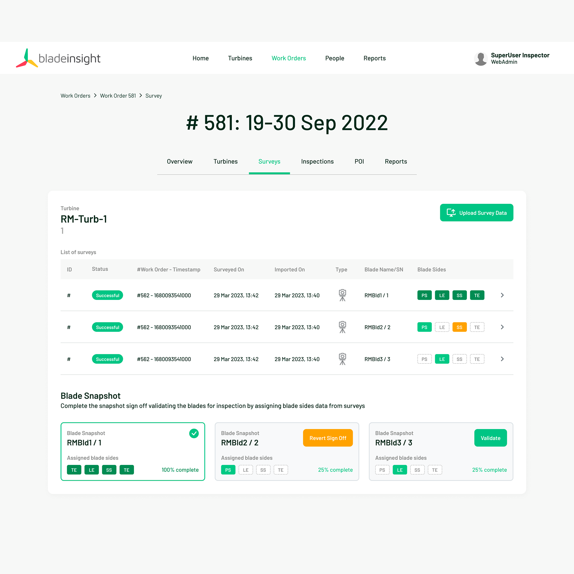
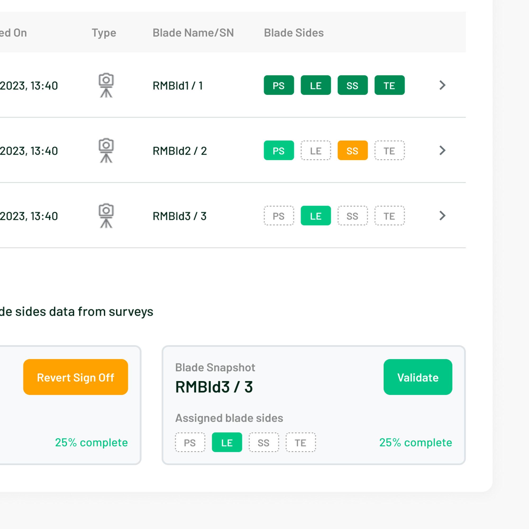
The Inspection Module required users to assign survey data to turbines and blades — a task with a clear mental model — but the interface didn't reflect it. No system status indicators, confusing task order, missing labels, poor element placement.
3. No design foundation to build from
There was no component library, no documentation practice, and no shared patterns. Every new screen was being designed from scratch, making consistency impossible at startup pace.
Process
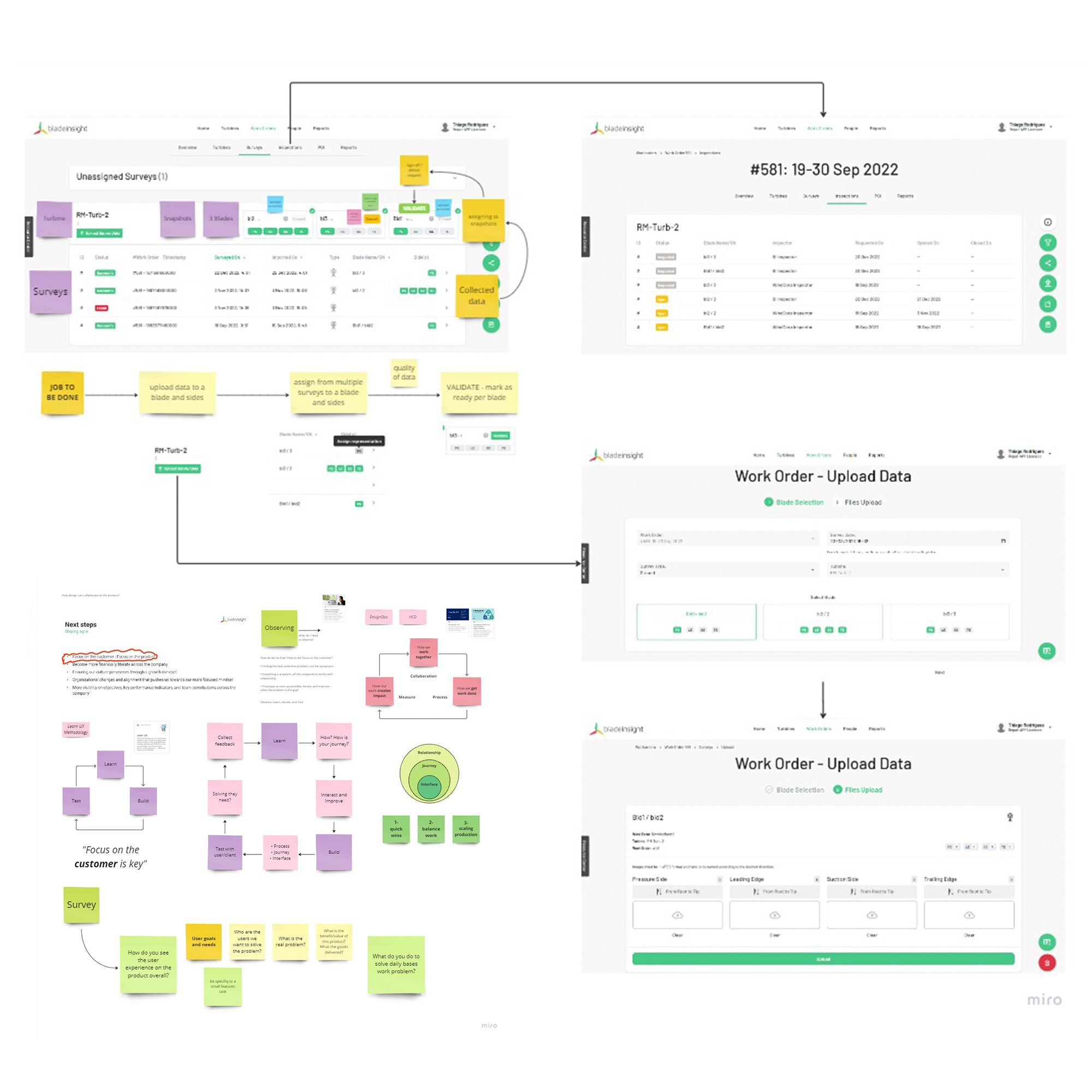
1. Workflow Mapping
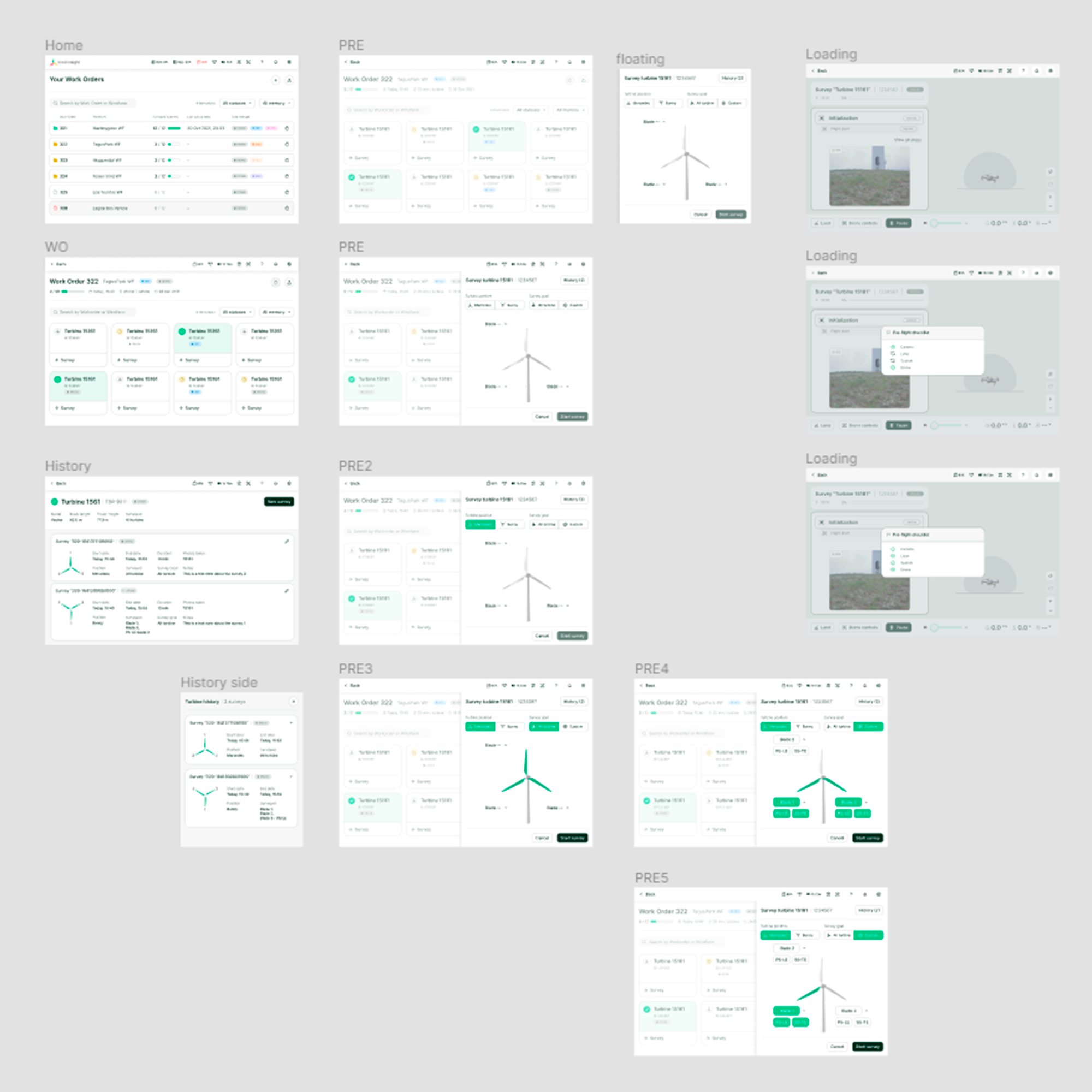
Mapped end-to-end user flows for each product before touching UI. For the Inspection Module, reordered form elements to mirror the operator's natural mental model: Select Turbine → Choose Blade → Assign Snapshot
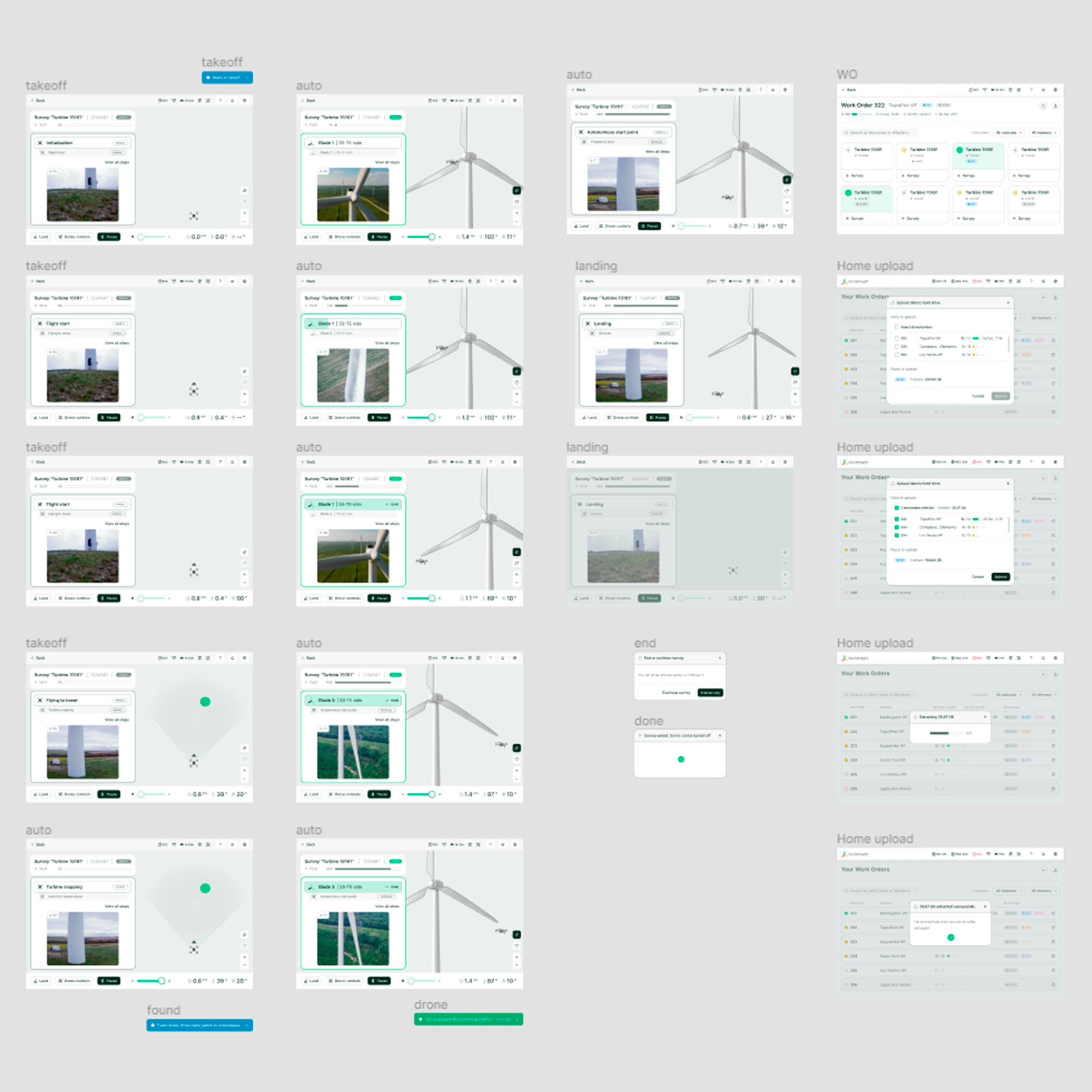
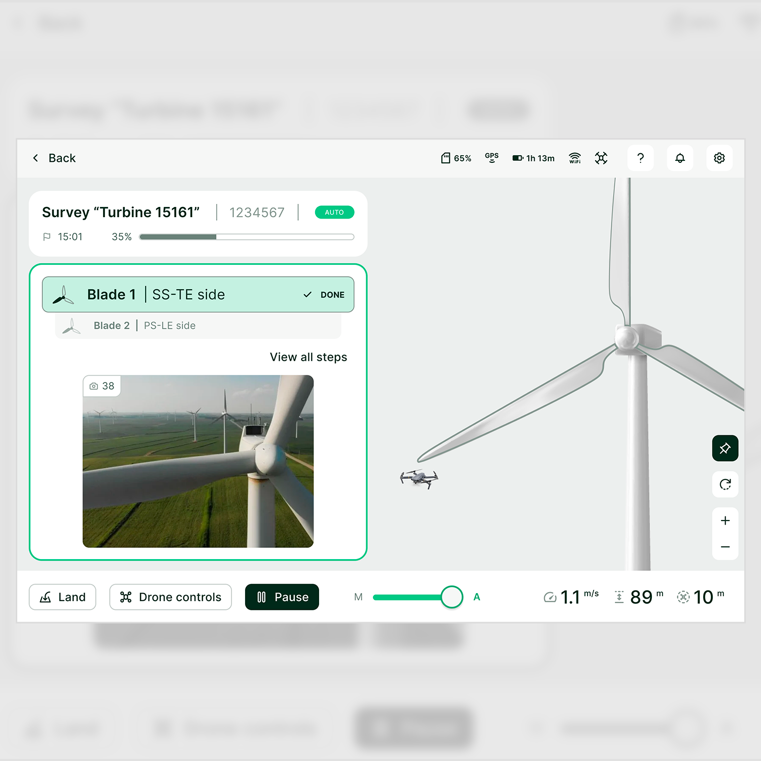
For AirSpector, mapped the full pilot journey from work-order list through manual and autonomous flight to data extraction — validating each step before prototyping.
2. Interface Design & Prototyping
Built clickable Figma prototypes for both products — playable demos that let technical and non-technical stakeholders walk through flows together.
Inspection Module:
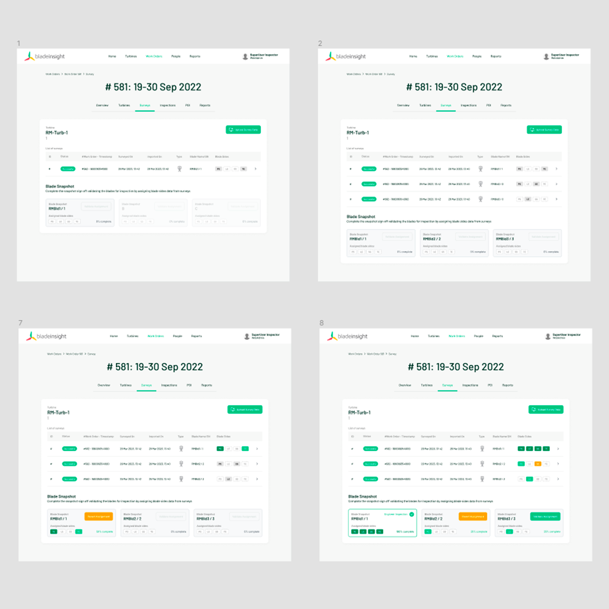
- 5 usability sessions, iterating on the assign survey flow
AirSpector:
- Prototype demos covering work-order selection and flight control, used for stakeholder walkthroughs.
3. Guidance & Feedback Systems
Added contextual tooltips and introductory task descriptions to the Inspection Module to reduce reliance on prior training. Designed toast notifications and colour-coded status badges for assigned, in-review, and completed states — giving operators clear system feedback at every step.
4. Design System — Ground Zero
Kicked off a Figma component library from scratch. Started with the elements that appeared across both products — buttons, toggles, menus, status indicators — and extracted them into shared components. Not a complete system, but a foundation that immediately reduced duplication and made cross-product consistency achievable.
For AirSpector specifically, simplified the screen layout using a clear visual hierarchy: flight controls grouped at the bottom, live feed and status information at the top — reducing cognitive load in a safety-critical context.
Projects
1. Inspection Module — Web Team
Redesigned the survey assignment flow under work orders. Resolved the four core UX failures — missing system status, confusing task sequence, absent guidance, poor element placement — through workflow reordering, contextual overlays, and a clear status feedback system. Delivered a playable prototype validated across 5 usability sessions.
2. AirSpector Drone Control — Robotics Team
Standardised the drone control interface across web and tablet, covering the full operator journey: work-order list, turbine selection, manual and autonomous flight, and data extraction. Extracted common UI elements into the nascent design system, simplified the flight control layout, and delivered two prototype demos for stakeholder validation.
Impact
- Two playable prototypes delivered and validated — used directly in stakeholder decisions
- A shared component library initiated, covering both web and tablet surfaces
- End-to-end operator journeys mapped and validated for both products — resolving ambiguous flows that were blocking the engineering teams
- Visual hierarchy simplified in AirSpector: a layout restructure that reduced cognitive load in a context where operator errors have real-world consequences
- Design documentation and pattern practices introduced to a team that had none — raising UX maturity in a fast-moving startup environment
Key Learnings
Playable prototypes move faster than documentation alone
In a cross-functional team with hardware engineers and non-design stakeholders, a clickable Figma demo resolved in one session what written specs couldn't settle in a week.
A minimal design system beats no design system
Starting with just buttons, toggles, and status badges — the elements that appeared everywhere — was enough to create consistency across products and give the team a shared vocabulary.
Safety-critical UX demands clarity over cleverness
In drone control interfaces, the cost of a confusing UI isn't frustration — it's operational risk. Every layout decision had to prioritise immediate legibility over visual interest.
Startup pace requires a different design discipline
Timelines were short, scope shifted fast, and ambiguity was the default state. The skill wasn't perfecting a single solution — it was moving quickly enough to learn, and documenting enough to not repeat mistakes.
Resources
Videos
Have a similar challenge?
Let's talk →