McKesson
UX design for B2B generic drug campaigns and internal finance tooling at McKesson — covering product recommendations, backorder communication, and cross-departmental journey mapping.
Client
McKesson Corporation
Year
2025

Context
McKesson is a global healthcare leader partnering with biopharma firms, care providers, pharmacies, manufacturers, and governments to make quality care more accessible and affordable. I joined via Randstad Digital, embedded in the B2B E-commerce team focused on generic drug campaigns — while also supporting internal finance tooling.
Work spanned four interconnected areas: BuySmarter Product Recommendation, Omits Communication & Backorder Watch List, Single & Multi-Item Search for Generic Campaigns, and MT Finance Stakeholder Research.
The Problem
Generic drug procurement is a high-stakes, high-volume process. Pharmacies and care providers need to identify suitable generics quickly, understand why items are unavailable, and act on backorder situations before they escalate into emergency orders. The existing experience created friction at every one of these moments — unclear recommendations, opaque omit reasons, and no real-time visibility into backorder status.
Team
UX Designer (me), UX Research, UI Design Systems, Designer Team Lead - interacting with Data Science, Developer, and Business Teams
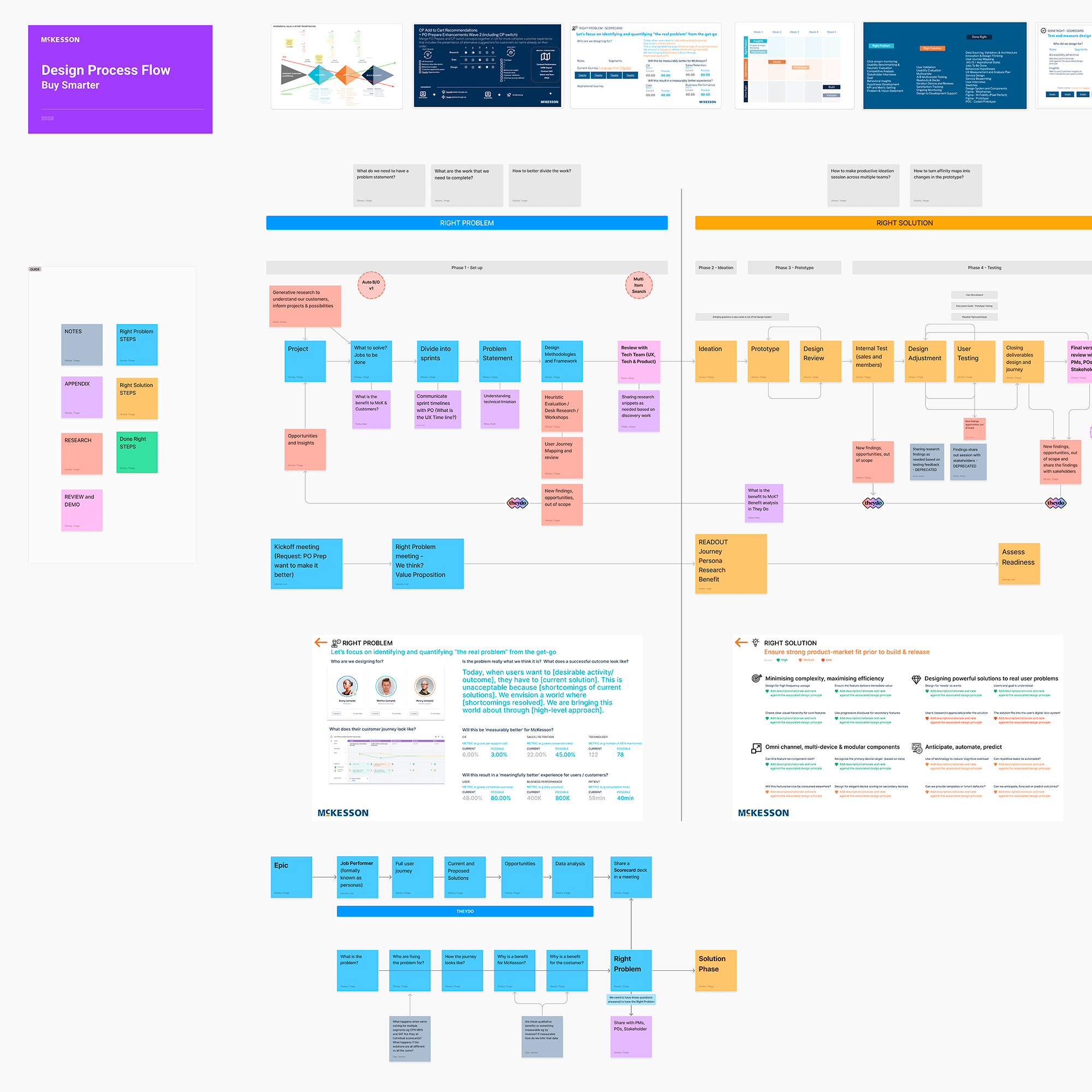
Process
Discovery & Alignment
Stakeholder workshops to map workflows and identify usability gaps. Competitive benchmarking against leading B2B platforms for best-practice patterns in regulated procurement contexts.
Research & Journey Mapping
Co-led 15+ stakeholder interviews across sales, operations, and finance teams. Synthesised findings into end-to-end journey maps with annotated decision points — used to align product, engineering, and compliance on where the experience was breaking.
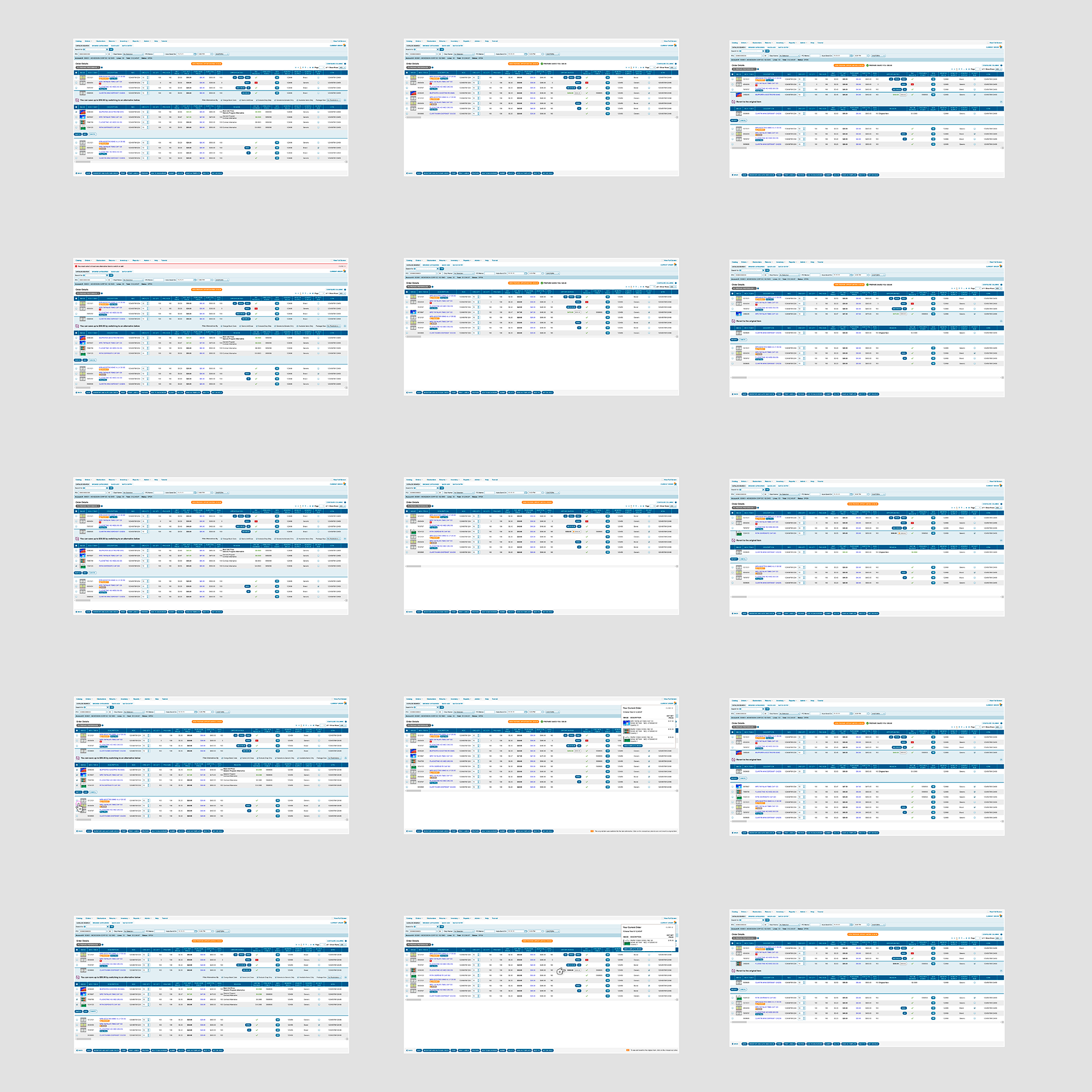
Design & Validation
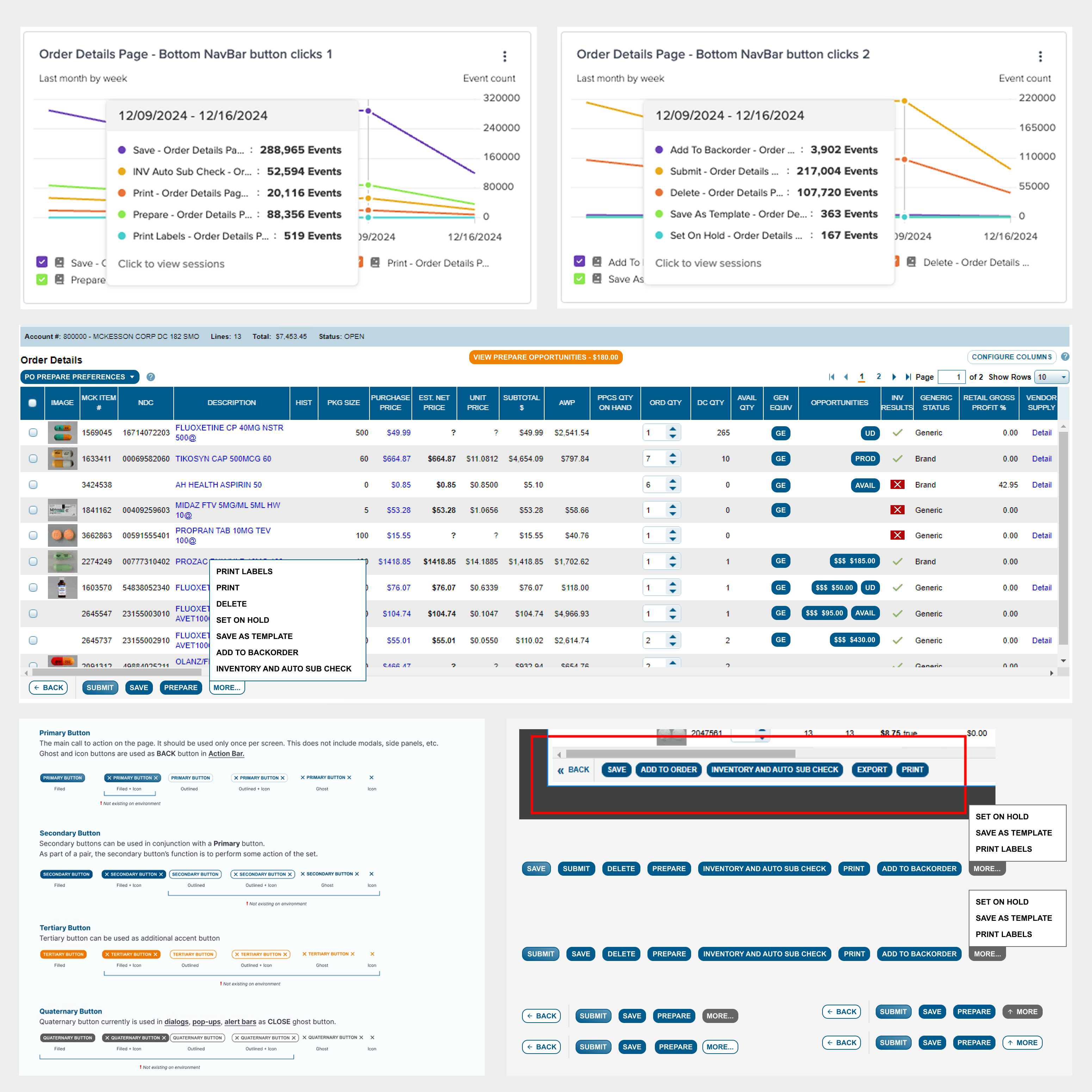
Wireframes and high-fidelity mockups in Figma. Usability tests to validate hierarchy and reduce cognitive load in data-dense interfaces. Iterated on recommendation cards, backorder dashboards, and omit communication patterns.
Handoff & System Contribution
Added 3 reusable components and documented 5 usage patterns to McKesson's shared design system — accelerating subsequent feature work across teams.
Projects
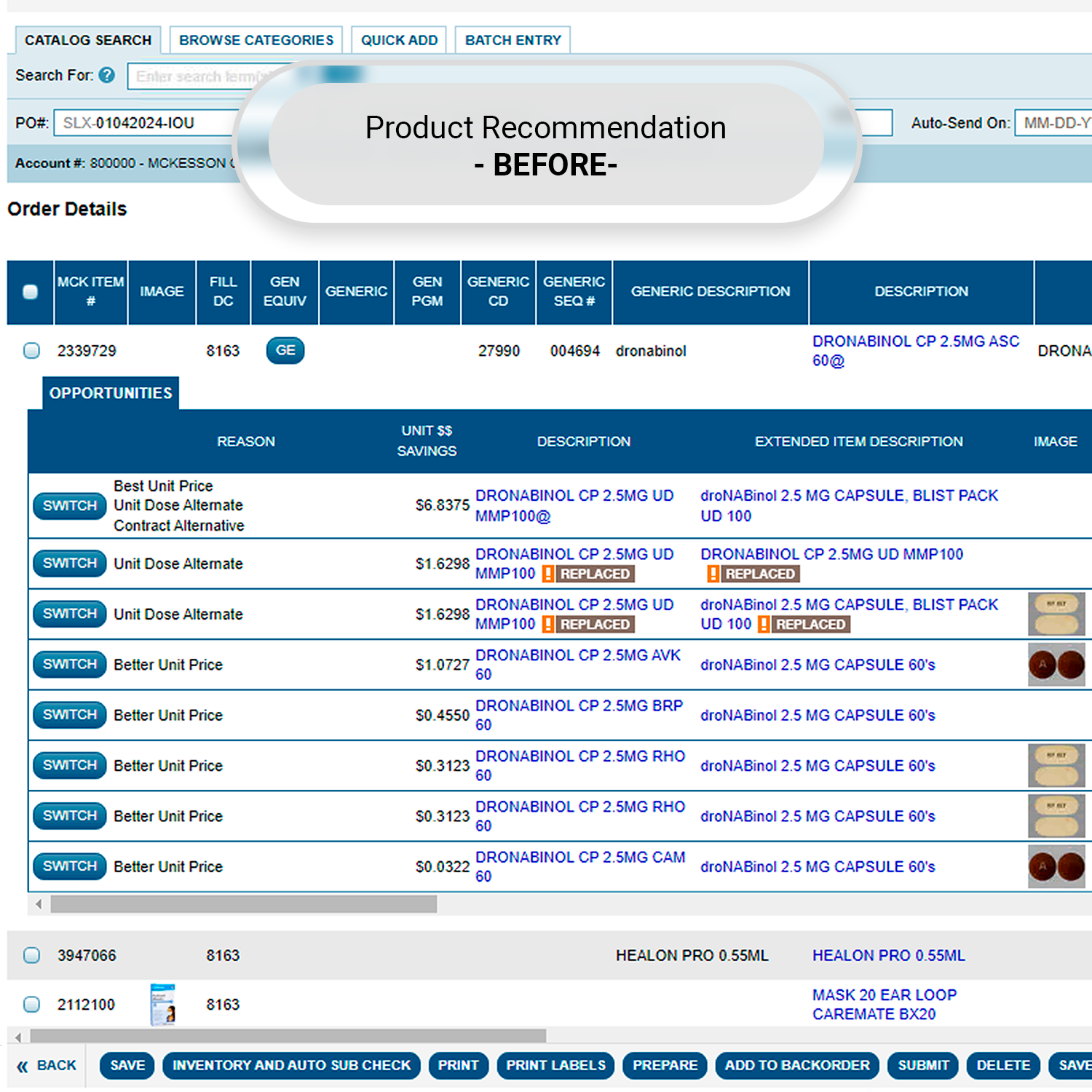
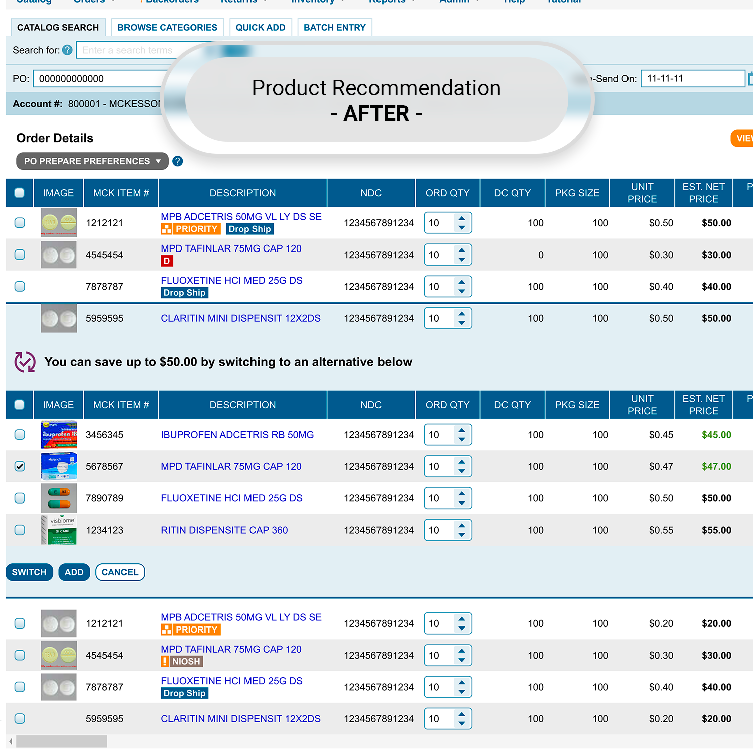
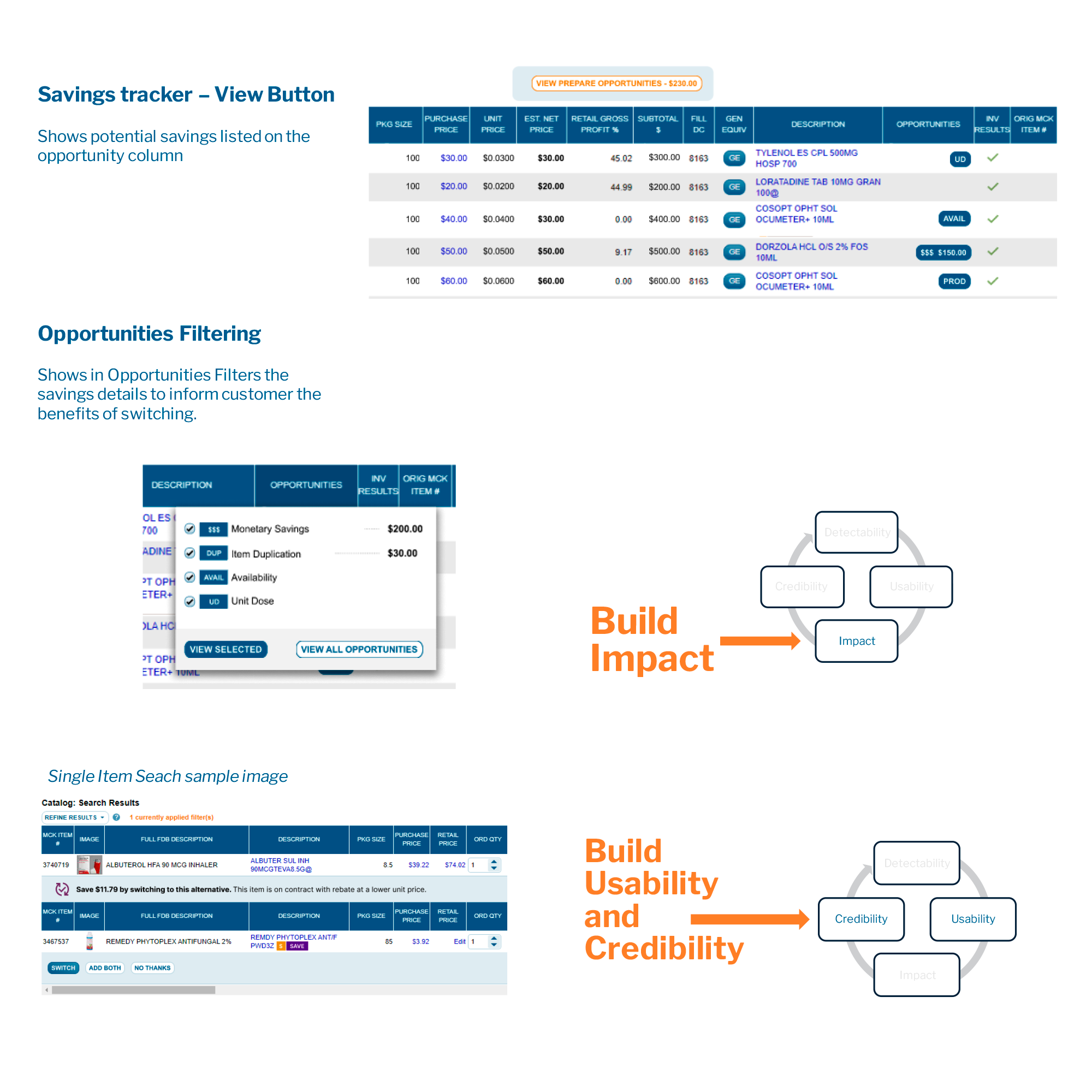
1. BuySmarter Product Recommendation
Redesigned the recommendation experience for generic drug conversion. Focused on data-rich recommendation cards that surface the right information at the right moment — enabling faster, more confident purchasing decisions without increasing cognitive load.
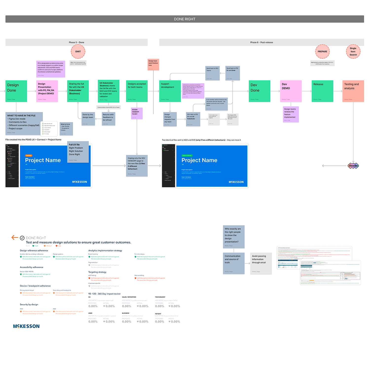
2. Omits Communication & Backorder Watch List
Introduced a real-time Backorder Watch dashboard. Designed the Omit Reason feature to surface why items were excluded from recommendations — turning an opaque system behaviour into a transparent, trust-building interaction. Both features reduced emergency order escalations and support tickets.
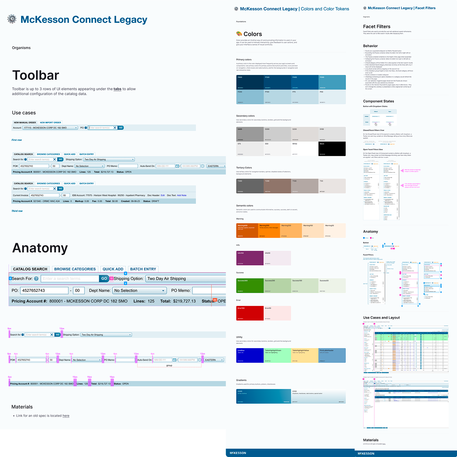
3. Single & Multi-Item Search — Generic Campaigns
Usability improvements to search flows for generic drug campaigns, improving task success rate and reducing time-to-complete across conversion journeys.
4. MT Finance — Stakeholder Research & Journey Mapping
Co-mapped internal budgeting journeys across 4 departments. Uncovered 10 process improvement opportunities. Proposed streamlined workflows estimated to save 15 hours/week in coordination overhead. — Full case study on McK Budget Process
Impact
- 15+ stakeholder interviews conducted across sales, operations, and finance
- 10 process improvement opportunities identified in MT Finance budgeting workflows
- 15 hours/week estimated reduction in coordination overhead from proposed workflow changes
- Real-time Backorder Watch dashboard introduced — reducing emergency order escalations
- Omit Reason feature improved user trust and reduced support ticket volume
- 3 components + 5 usage patterns added to the shared design system
Key Learnings
Transparency is a feature
Showing users why an item was omitted or back-ordered — rather than just surfacing the outcome — changed the interaction from frustrating to trustworthy. In regulated procurement, confidence in the system is as important as speed.
Data density requires design discipline
Generic drug recommendation cards needed to be information-rich without being overwhelming. The design challenge wasn't adding data — it was deciding what to surface, in what order, at what moment.
UX in large organisations is a systems problem
Contributing to a shared design system isn't housekeeping — it's how design impact scales beyond the feature you're currently working on.
Videos
Have a similar challenge?
Let's talk →